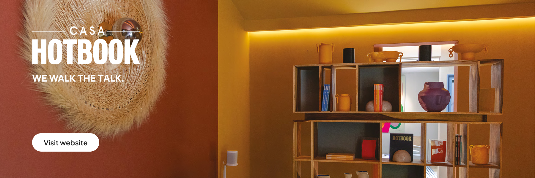
Rooms that invite calm. Kitchens that awaken the appetite. Hallways that seem longer than they really are. Some spaces feel like a warm embrace, while others inexplicably make us uncomfortable. What makes them so different? Furniture matters. Lighting too. But often, the answer lies in something almost invisible. Let’s talk about how color psychologyworks in interior design.


At its core, color psychology is the study of how colors make us feel. And while it may sound abstract, its influence is profound. In interior spaces, color does more than decorate—it shapes how we think, how we act, how we relax, and even how we interact. Designing with color means designing with emotion.
Each Color Has a Personality
Without saying a word, color builds atmosphere:
- Blue: calm, focus, introspection. Ideal for spaces where rest or concentration is needed.
- Green: freshness, balance, nature. It’s the easiest color for the human eye to perceive.
- Yellow: energy, light, stimulation. In the right amount, it can spark creativity and lift the mood.
- Red: urgency and intensity. In excess, it can be overwhelming.
- Orange: sociability, warmth, connection. Encourages lingering and conversation.
- Purple: depth, luxury, mystery.
- Gray and Black: sobriety, pause, elegance. Without contrast, they can feel isolating.
- White: spaciousness, silence, order. Depending on context, it can feel like peace—or emptiness.
The Emotional Function of Color
Colors should align with the emotional purpose of the space.
According to color psychology in interiors, bedrooms benefit from slower, more tranquil tones like blues, sand hues, or soft neutrals. Social areas thrive with warm accents—think terracotta, copper, or mustard—which invite connection. Creative spaces benefit from contrast and vibrant tones that spark ideas. And in small kitchens or bathrooms, light colors help expand the visual perception of space.


There’s a crucial variable in all of this: context. Color is also culture. It’s memory.
White symbolizes purity in one country and mourning in another. A single shade can evoke childhood, a journey, a trauma, or a physical sensation. Designing with color also means designing with personal history. Following formulas isn’t enough—we must observe not only what a color looks like but also what it evokes.


In a world saturated with visuals, meaningful design doesn’t just appeal to the eye—it resonates through the body. A truly well-designed space isn’t just one that photographs well—it’s one that shifts your mood without you knowing why. And in that silent transformation, color takes the lead.
Designing with color is creating emotional architecture. It allows walls to whisper what words cannot express. It builds atmospheres that, without us realizing it, become internal states. Because in the end, to inhabit a space is also to inhabit its colors.